Anomaly detection
An interactive tutorial
In this chapter, you’ll learn how to model systems with the normal distribution and Python. You’ll learn how to detect anomalies by setting an optimal control limit. Along the way, you’ll learn how the prostate works, and how control limits might just save your life.
Welcome back! Your employer, Congo.com, has a great healthcare package. Once per month, they send you a kit to take a blood sample. You then get a lab report of hundreds of biomarkers. This includes common things like Vitamin B12 levels, and more obscure stuff like Eosinophil levels (which can indicate high levels of parasitic infection!).
In January, you get your first reading for a biomarker called PSA, or Prostate-Specific Antigen. It’s 1.0 nanograms per milliliter of blood. Does that level seem worrying?
Well, I’d say it’s hard to tell. Readings in isolation are hard to interpret.
Well, I’d say it’s hard to tell. Readings in isolation are hard to interpret.
Yeah, readings in isolation are hard to interpret.
But in February, you get your second reading. It’s 1.5 mg/mL. Should we be worried?
True, but it’s hard to know whether that will continue. Maybe 1.0 and 1.5 are both “normal” readings, and it’ll go back down next month? We need to know what “normal” looks like.
A great question! Maybe 1.0 and 1.5 are both “normal” readings. We need to know what “normal” looks like.
Homeostasis
Here’s a model of how normal PSA readings are generated:
The prostate produces PSA. A constant amount P leaks into the blood each day.
Each day, the liver and kidneys remove some proportion D of the PSA in the blood.
This model in Python might look like:
P = 0.12  # Amount of PSA leaking into the blood per day
D = 0.7  # Decay rate - half-life of 2 days

psa_levels = [0.]  # starting point
while True:
  psa_levels.append(psa_levels[-1] * D + P)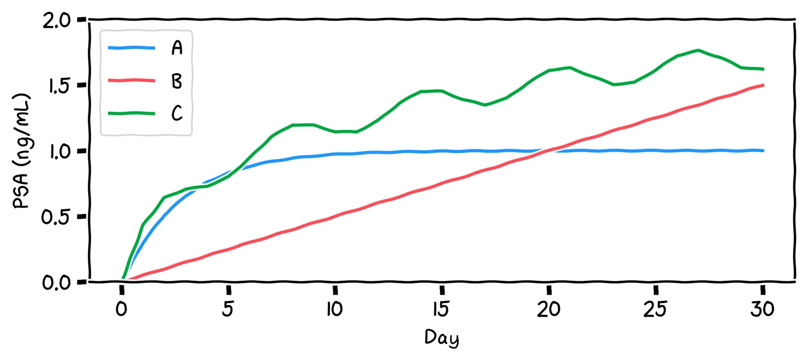
Say we run this model for a while. Which of the shapes above will it look like?
Indeed!
No, it’ll actually reach a stable level. This is because, as the PSA level rises, the decay mechanism works harder to reduce it. At some point, the decay rate becomes equal to the production rate. The PSA level then stays constant.
No, it’ll actually reach a stable level. Initially, the PSA level rises, but as it does so, the decay mechanism works harder to reduce the PSA level. At some point, the decay rate becomes equal to the production rate. The PSA level then stays constant.
Our model suggests that a normal PSA level is a steady, flat line. We say that such systems are in control. The above decay rate D is called the control mechanism, implemented by the liver and kidneys.
Your body has lots of control mechanisms! For example: when your water levels become low, you become thirsty, which causes behavior like drinking, which increases your water levels again. As such, most healthy biomarkers are flat lines.
The fancy term for this is homeostasis. Thanks to homeostasis, we can write a much simpler model of normal PSA levels:
# The aggregate effect of P and D
stable_psa_level = 1.0

psa_levels = []
while True:
  psa_levels.append(stable_psa_level)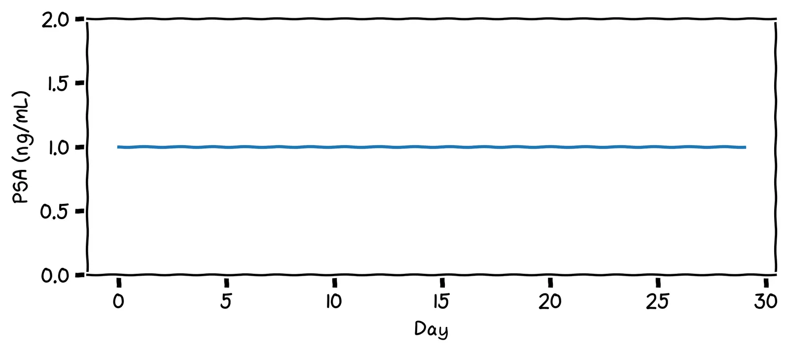
Not so fast! Let’s develop a more nuanced definition of “in control”. After one year of records, your PSA chart looks like this:
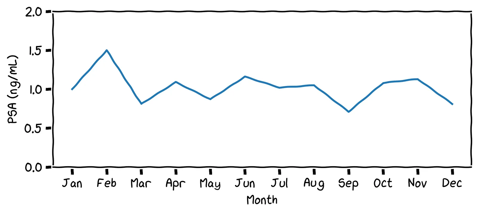
What impression do you get from this chart? Does it look “in control”?
Yes, I’d say it’s in control. It hovers around the value 1.0.
I appreciate that: it certainly is fluctuating. But it does fluctuate around a steady value, with no upward or downward trend. We’ll say it’s in control.
More biomarkers 🦠
Remember your lab test result has hundreds of readings! Here are some of your readings from the previous year:
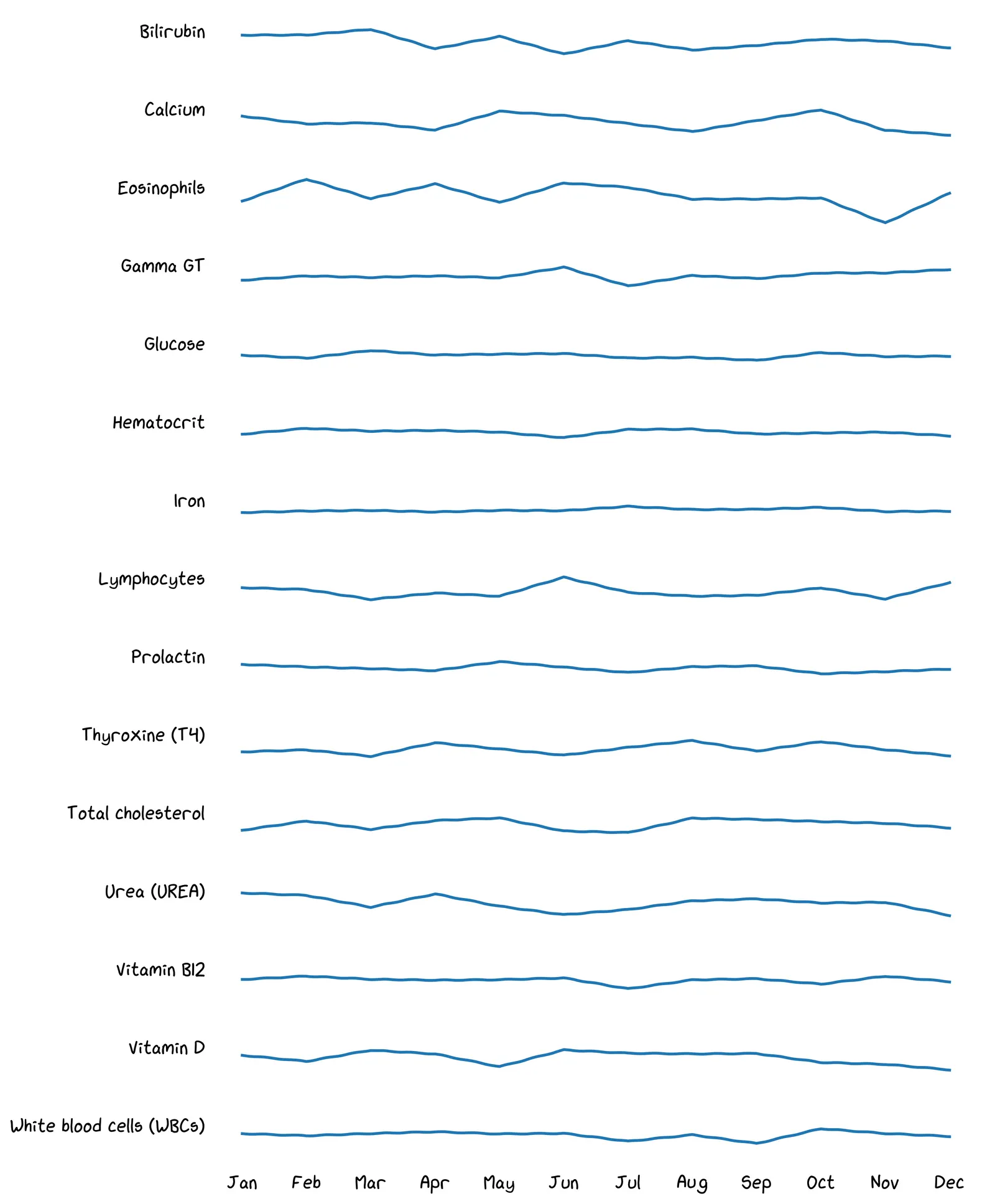
A benefit of this data is seeing early indications of health problems, helping you decide whether to consult a doctor. Take a look at your data above. Do any recent readings look worrying to you?
Maybe! But the broader point is: there are so many readings, it’s too hard to eyeball everything every month.
Yeah, your life is busy! You can’t be eyeballing all these timeseries every time you get a report.
So what do we do when we have too much data? Data science! 💪 We want to give all this data to a computer, and have it say either “all looks good”, or, “Something might be up with this metric; maybe take a closer look?”
To do that, we need a definition of “stability” that our computer can judge.
Fluctuations 🤔
The question is, where do all those fluctuations in your PSA level come from? If we assume the control mechanism is in place, which of the following could have caused those fluctuations?
All of these are possible! Yes, even bike riding is known to increase PSA levels! If we try to write down our model, it might look like this:
psa_levels = []
while True:
  new_prostate_level = 1.0

  if went_bike_riding():
    new_prostate_level += 0.02
  if sexual_activity():
    new_prostate_level += 0.01
  if time_of_day() > 12:
    new_prostate_level -= 0.03
  # many more causes ...

  psa_levels.append(new_prostate_level)
Shall we write down a full list of all the possible causes of PSA variation?
Hmm, yes. It seems like there are just too many activities to model, most of them have transient effects, and we don’t have any data on them anyway. Let’s try something else.
The normal distribution 🔔
Instead of trying to imagine all those specific activities, we can imagine that each of your PSA readings is produced like this:
psa_level = 1.0

# Do 500 activities each day.
# Each has a small random effect on PSA production.
for _ in range(500):
    if random.random() < 0.5:  # coin flip
        psa_level += 0.01
    else:
        psa_level -= 0.01
Assume this is how PSA readings are generated. Imagine we take readings on lots of days, and plot out often each reading comes up.
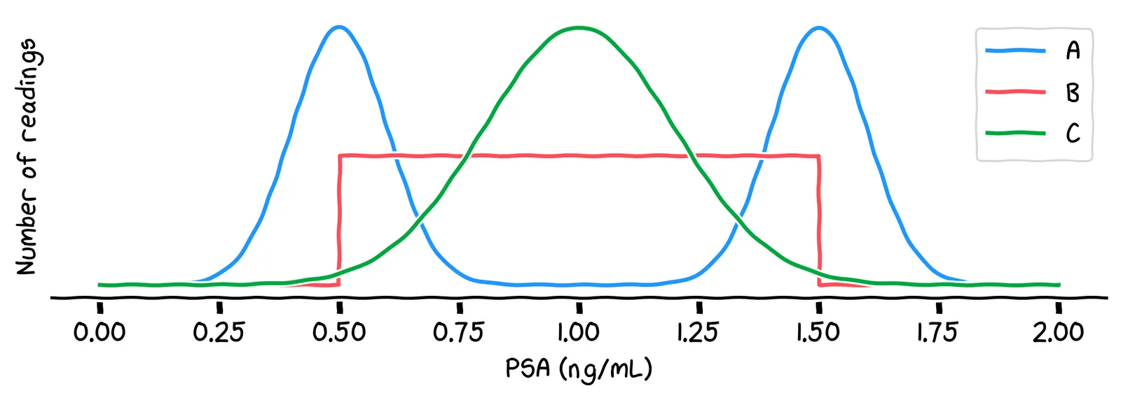
Which of the above lines best describes which readings will be most common?
No, it’s line C. One way to see this is: the most common value will be around 1.0, because there are lots of possible combinations of activities that generate that value. Other values, like 0.5 or 1.5, are less common, because there are fewer possible combinations of activities that generate those values.
No, it’s line C. One way to see this is: the most common value will be around 1.0, because there are lots of possible combinations of activities that generate that value. Other values, like 0.5 or 1.5, are less common, because there are fewer possible combinations of activities that generate those values.
That line C is called a normal distribution. It’s what we get when we add up a very large number of small random shifts. Using this distribution, we can write our simulation like this:
mean = 1.0
std_dev = 0.2

psa_levels = []
while True:
  psa_levels.append(np.random.normal(loc=mean, scale=std_dev))
That value 0.2 is called the standard deviation. It describes how “spread out” the distribution is, which is controlled by how big those random shifts are.
Now, remember that your PSA reading increased 50% between January and February. Using our new terminology, we wanted to ask: was this caused by a change in the mean, or was it just due to “normal” variation?
Control charts 📈
All of this makes you think back to your work at Congo.com. At each fulfilment center, there’s a big control chart on the wall. It shows the mean number of packages sent per employee on each day:
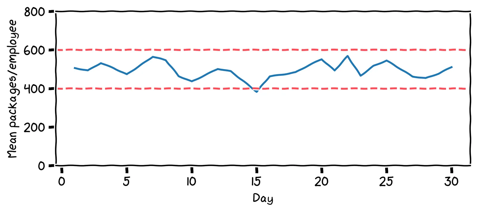
Those lines are called control limits. If the number of packages ever drops lower than that 400 line, or goes above that 600 line, alarms go off, and management is notified. A healthy factory, just like a healthy body, should have stable charts!
How many times was management alerted in the last 30 days?
The alarm went off on day 15, where the value dropped below 400. Management then did an investigation. They found the main cause of the low value was that a staff member had to take the day off due to food poisoning. The staff member returned the next day.
Walter Shewhart, the inventor of the control chart, introduced some useful vocabulary. He said that there are two causes of variation:
Common-cause: Normal, transient effects. The process will quickly return to the mean.
Special-cause: A change to the system itself. The process will not return to the mean.
When the value dropped due to the staff member getting food poisoning, what kind of variation was this?
I’d say it’s common-cause variation. Staff illnesses are not unusual. The effect of the staff absence was short and transient.
But suppose, on Thursday, the packaging machine breaks. The staff revert to doing all the packaging by hand. What kind of variation would this be?
It’s special-cause variation: the system that produces the packages is broken, and it won’t recover without intervention.
Can we set a control limit on our PSA readings, too? Thinking back to the spike in your PSA readings, which of these is a special cause of variation?
Of these, only prostate cancer is a special cause of variation. Prostate cancer typically causes an increased PSA production rate, and causes a higher proportion of that PSA to leak into the bloodstream. As a result, our PSA readings will reach a higher mean.
Control limits 🚨
The big question when designing a control chart is: what’s the best control limit?
As you’ve seen in previous chapters, whenever we’re trying to find a “best” value, we should first identify the thing that we’re minimizing or maximizing. When setting a control limit on our PSA levels, which of the following seems like a good thing to optimize for?
Well, the problem with minimizing delay is that there’s an easy, but bad, way to do it: get tested every day, and go to the doctor every day. But this would be an expensive waste of time. We need to factor in our time, stress, and money.
We don’t have much control over PSA levels. And besides, we don’t want ultimately care about PSA levels: they’re just a diagnostic tool.
It might sound strange, but a good thing to minimize is expected cost in dollars. That’s because many kinds of bad outcome can be converted into a financial cost.
There are two kinds of cost to consider. If we set the control limit too close to the mean, we’ll get alerts due to common-cause variation, like horse riding. We call these outcomes false positives. If we set it too far from the mean, we won’t get alerted even when there’s special-cause variation, like prostate cancer. We call these outcomes false negatives. Let’s try to estimate their costs.
Suppose our control limit sets off an alarm, then we go to the doctor for a prostate biopsy. The biopsy result finds that everything is fine: no cancer. Is this a false positive or false negative?
No, it’s a false positive: we got an alert, but there was no problem.
Let’s consider assigning a cost to that false positive. Which of these seems like a better cost estimate?
This is subjective, but $1,000 seems better to me. $10 won’t pay for the lost time and additional stress.
Now suppose in April, we develop prostate cancer, but we only get an alarm in December. During those months May to November, what type of error did we get?
Here, we’ve paid in worse health, healthcare costs due to late detection, and potentially even paid in our lifespan. What seems like a good cost estimate for one month of delaying treatment?
I’d assign it around $10,000. Again, this is subjective, but $100 seems too low.
Estimating probabilities
We can now draw out a probability tree of the four possible outcomes and their associated costs:
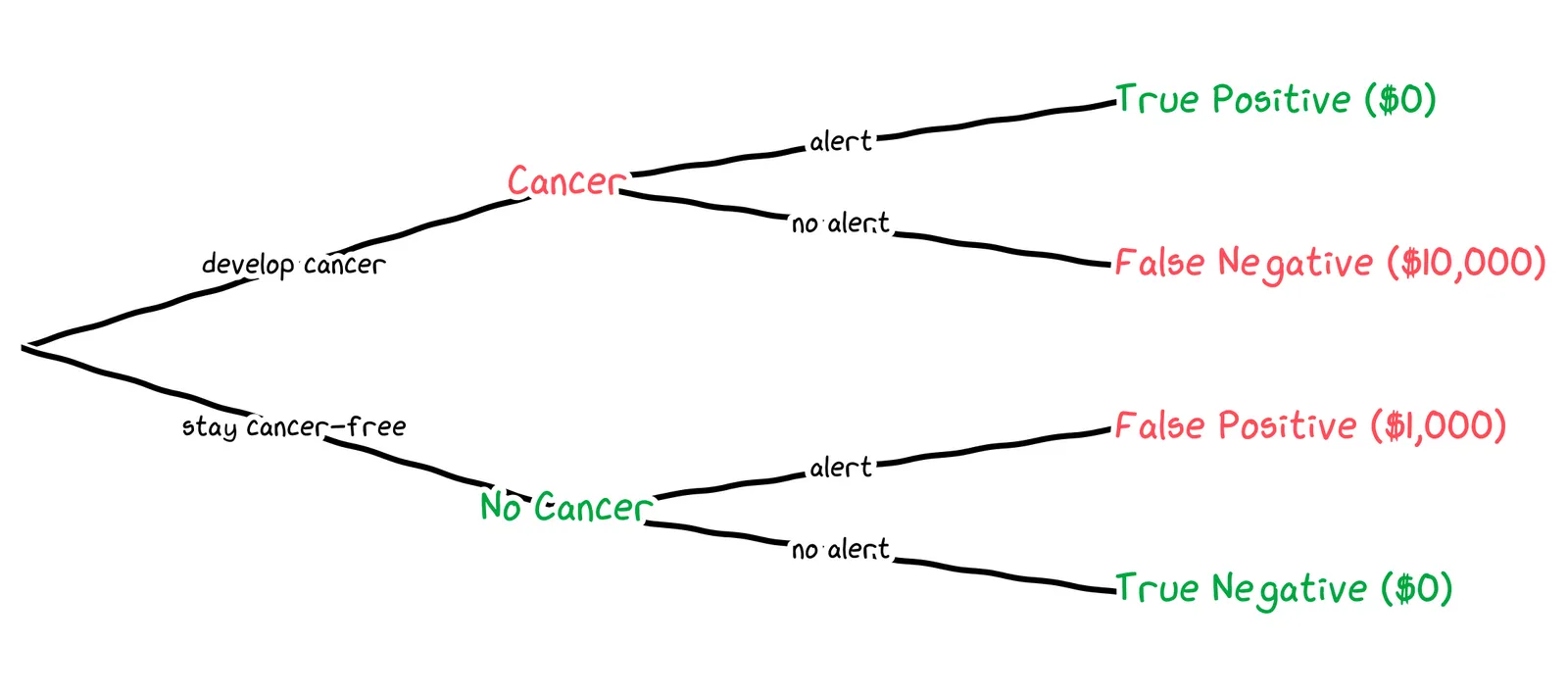
To get an expected value of the cost, we need the probability of each outcome. We’ll need to estimate three probabilities:
The probability of developing cancer next month
The probability of getting an alert, given that we have cancer
The probability of getting an alert, given that we don’t have cancer
In the USA, around 13% of men develop prostate cancer in their lifetime. Which of the following seems like a reasonable estimate for how likely it is that we’ll develop cancer next month?
0.02% is a reasonable estimate. 99.98%(12×70)≈84% chance of living cancer-free for 70 years, which is empirically reasonable. By contrast, a 2% chance of cancer per month results in almost-certain cancer during a lifetime.
0.02% is a reasonable estimate. 99.98%(12×70)≈84% chance of living cancer-free for 70 years, which is empirically reasonable. By contrast, a 20% chance of cancer per month results in almost-certain cancer during a lifetime.
Next, we need to estimate the probabilities of getting an alert, given that we have don’t have cancer. That is, assuming that everything stays as-is, with mean 1.0 and standard deviation 0.2, what is the probability of getting a value above our control limit?
To answer this, we can use the cumulative distribution function of the normal distribution. This chart shows, for each possible PSA level, the probability that the next reading will be below that, assuming our mean of 1.0 and standard deviation of 0.2.
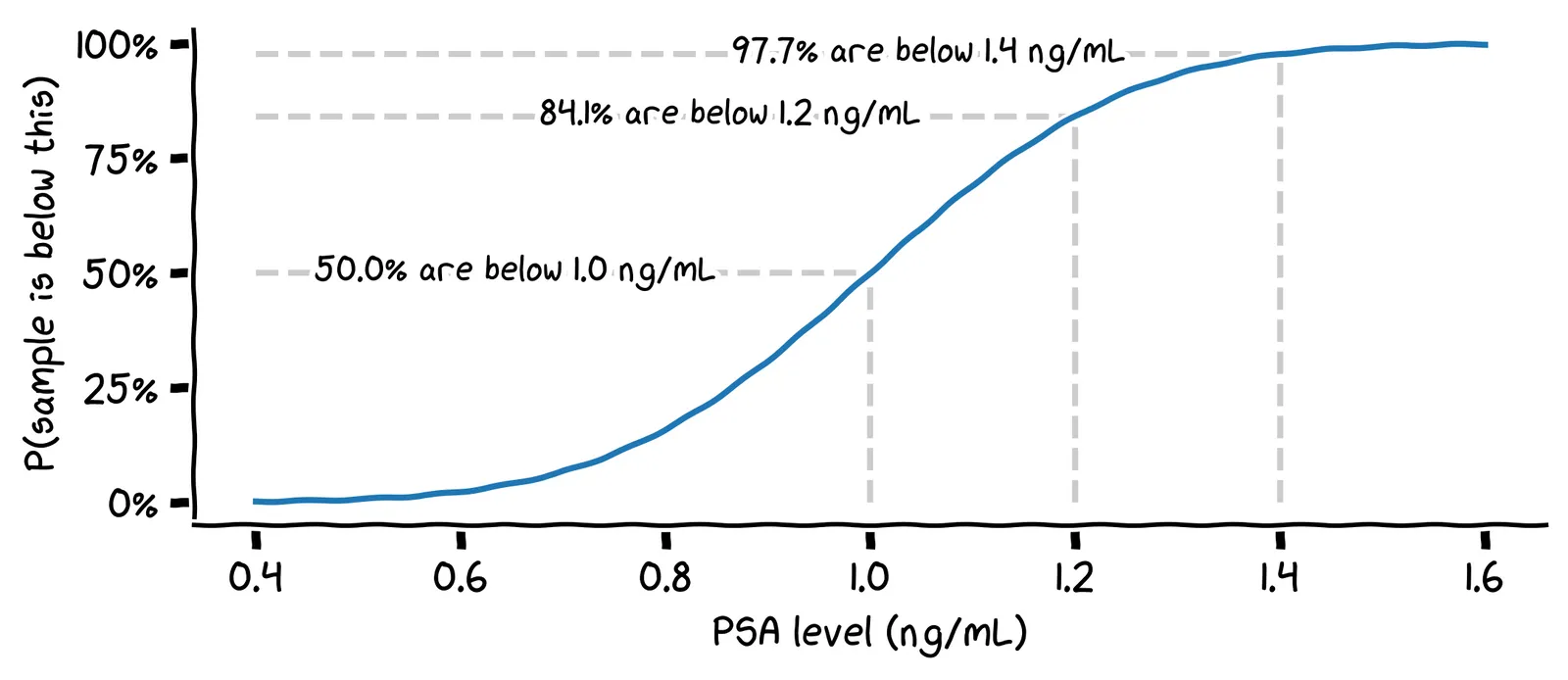
Assuming you don’t have cancer, what is the probability that your next PSA reading will be above 1.4 ng/mL?
We can find this by looking at the value 1.4 on the x-axis, and reading off the value 97.7% on the y-axis. This gives us the probability that the next reading will be below 1.4 ng/mL, so the remaining 0.3% is the probability that it will be above 1.4 ng/mL.
We’re almost done! Finally, what’s the probability of getting an alert, given that we do have cancer?
This is a tricky empirical question. Here’s a simplistic answer. PSA levels typically rise as the cancer develops, often to hundreds of ng/mL. A limit of 4.0 ng/mL is often used to detect signal prostate cancer in the general population. An early-stage cancer in us might have a mean of 2.0 ng/mL. To signal our uncertainty, we can use a wider standard deviation of 1.0 ng/mL.
Then we can use the CDF of this distribution to find the probability of getting a false negative.
Putting this together, we can draw out a probability tree for a specific control limit. For example, if we were to choose a control limit of 1.4 ng/mL, we’d get the following tree:
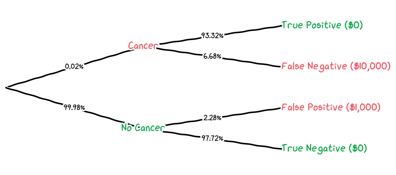
We can calculate the expected cost for this control limit like so:
We get that, for a control limit of 1.4 ng/mL, the cost of false negatives is $0.13, the cost of false positives is $22.80, and the total cost is $22.93. How does this suggest we should adjust our control limit?
The cost of false positives, $22.80, is dominating. We’re getting false alerts too often. We should set our control limit higher.
We can run this calculation for all possible control limits, and plot the expected cost per control limit:
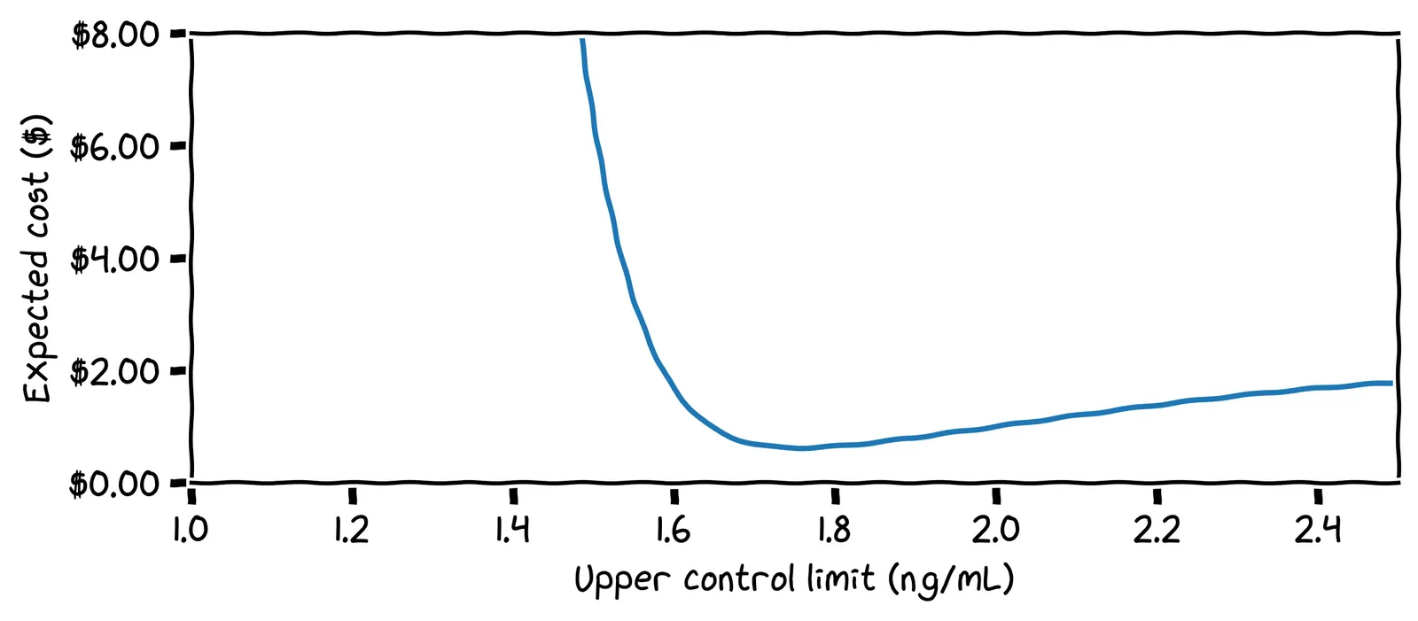
What is our optimal control limit?
Cool! We can set our limit at 1.75 ng/mL and forget about looking at the chart until we get an alert!
The effect of priors
Our optimal control limit depended on many things. For example, we estimated a 0.02% chance of developing cancer next month. But suppose you discover that you have a family history of prostate cancer. How should this affect your control limit?
You should lower your control limit to be more cautious. For example, if you raise the chance of cancer by 10× to 0.2% per month, the adjusted cost chart looks like this:
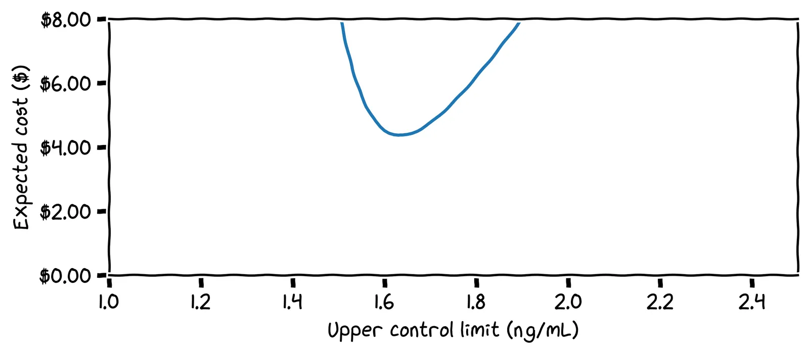
Here, the optimal control limit is only 1.63 ng/mL.
Setting limits for all biomarkers
So, that’s one biomarker done! Now for the other 499 biomarkers in the report! We’ll have to do similar modelling: how likely are we to develop disease, what would our readings look like if we did, and how expensive are the false positives and false negatives?
Our friend Walter Shewhart can help us again! He would have said: “just set your control limit at three standard deviations from the mean.” For our PSA readings, the mean is 1.0 and the standard deviation is 0.2. If we were to set our upper control limit using this industry standard, what would its specific value be?
The standard deviation is often denoted as σ. Our standard deviation above was σ=0.2 ng/mL. If we add three lots of this to the mean, we get 1.0+3×0.2=1.6 ng/mL.
A great question! And if you ask industry experts, they’ll say things like: “this is empirically the best setting”.
Above, our first control limit was 3.75σ. Our more cautious control limit was 3.15σ. It turns out that, even for very different estimates of risk and error costs, the optimal control limit sits around 3σ. So 3σ is a good default if you don’t know anything about the system you’re modelling.
Enough theory: does it work?
Surprise: this story is a true one! Only the names have been changed to protect the innocent. In real life, my friend’s PSA chart looked like this:
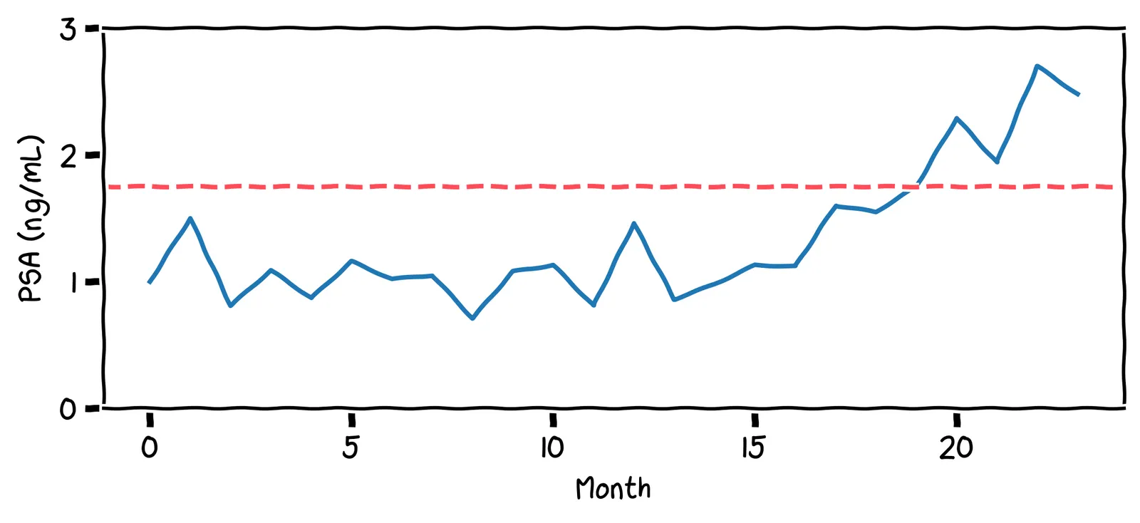
These PSA values are much lower than the threshold used by physicians (4.0 ng/mL). Even so, they hit my friend’s personal upper limit of 1.75 ng/mL. As a result, my friend decided to get a biopsy. They found he had prostate cancer, but it had not yet metastasized. They had caught the cancer in time, with not a moment to lose!
Your personal baseline may not reflect the population as a whole. This is why personal statistics are so important, and can be more reliable indicator than a comparison against the population.